El Secuestro del Vuelo 601: Key Art for a Netflix Series
Bogotá, Colombia · May 14, 2024 · 3 min read
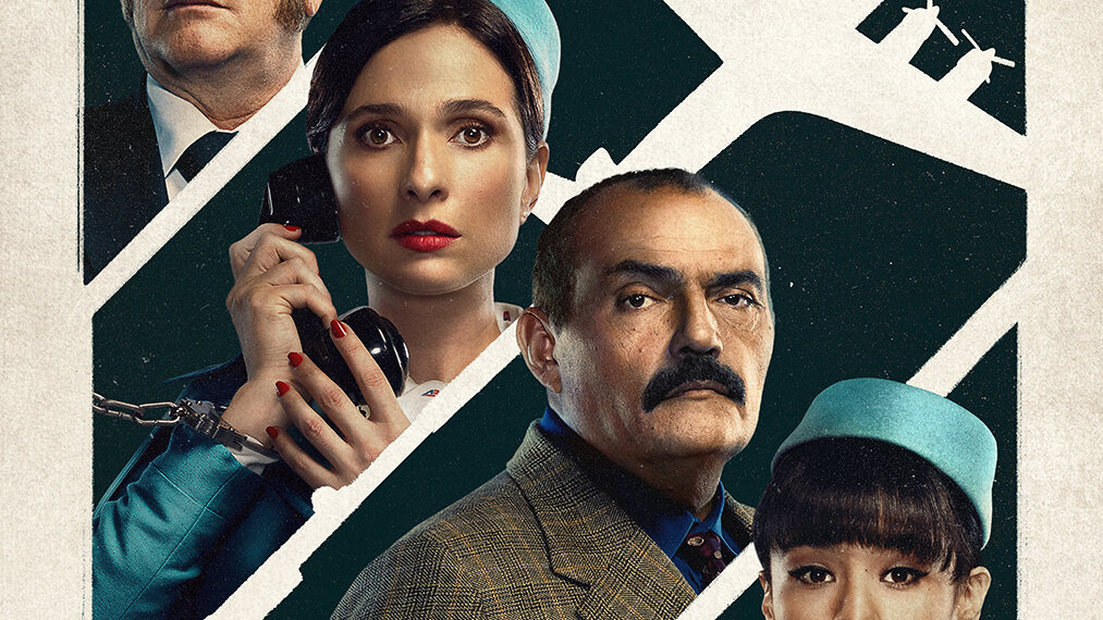
Character posters and key art for Netflix's Colombian hijacking drama — a crew and their captors rendered in a tense 1970s palette, with a paper-white plane slicing through every frame.
"Inspirada en hechos reales" — inspired by real events. That single line at the bottom of the poster changes everything about how you photograph a series. El Secuestro del Vuelo 601 dramatises one of the most audacious hijackings in Colombian history, and Netflix needed key art that felt like both a thriller and a period document at once.
My work on the campaign was the character key art: the faces that would sell the story on billboards, apps and thumbnails. A hijacking drama lives on tension between ordinary people — crew, passengers, captors — so the campaign put those faces one by one against the same charged backdrop and let the viewer feel the standoff.
A 1970s palette with modern teeth
The art direction planted every portrait in the era: aviation blues and paper creams, a flight attendant's pillbox cap, the captain's gold-striped sleeves, a hijacker's plaid jacket. Against that vintage softness we kept the light hard and the expressions harder. The contrast — gentle palette, ungentle faces — is where the poster gets its dread.
Cutting through each frame is the campaign's best graphic idea: a paper-white silhouette of the aircraft, part diagram, part ghost. It ties the character posters together and puts the real protagonist — the plane itself — inside every single image without showing a foot of runway.
Faces that hold a standoff
Each character poster had to work alone and in the set. The flight attendant grips a cabin telephone like a lifeline; the captain adjusts his tie as if control were still his; the man in plaid simply looks at you, which is somehow worse. Photographing actors in character for key art means directing for subtext — not "look scared", but "decide, right now, whether to cooperate".
It is the same discipline I built on my HBO campaigns, from the red-and-blue tension of Entre Hombres to the jungle dread of Mil Colmillos: compress a season of story into a single held breath.
“A key-art portrait is a held breath. The viewer should feel the exhale is up to them.”
Working inside a streaming campaign
Streaming key art is photographed for a dozen crops at once — vertical posters, horizontal heroes, tiny thumbnails on a phone. Every composition had to survive amputation: faces high and central, the title zone protected, the white plane readable at any size. You are not making one image; you are making a system of images.
Working with Netflix's creative teams sharpened the system further. Colour, grain and typography were locked across the campaign so that a poster seen on a Bogotá bus stop and a thumbnail seen in Berlin read as the same object. Consistency is what makes a campaign feel inevitable.
Colombian stories on the world's screen
The most satisfying part of this commission was its address. A Colombian story, shot in Colombia by Colombian hands, distributed to every territory Netflix reaches. Our stories used to need permission to travel; now they board directly. Being trusted with the faces of that journey — the crew, the captors, the era — is the kind of work I want more of.
These are the posters from the campaign: the main art with the whole cast beneath the title, and the character portraits that carried the standoff one face at a time.
From the shoot
5 photographs · tap to enlargeRelated stories
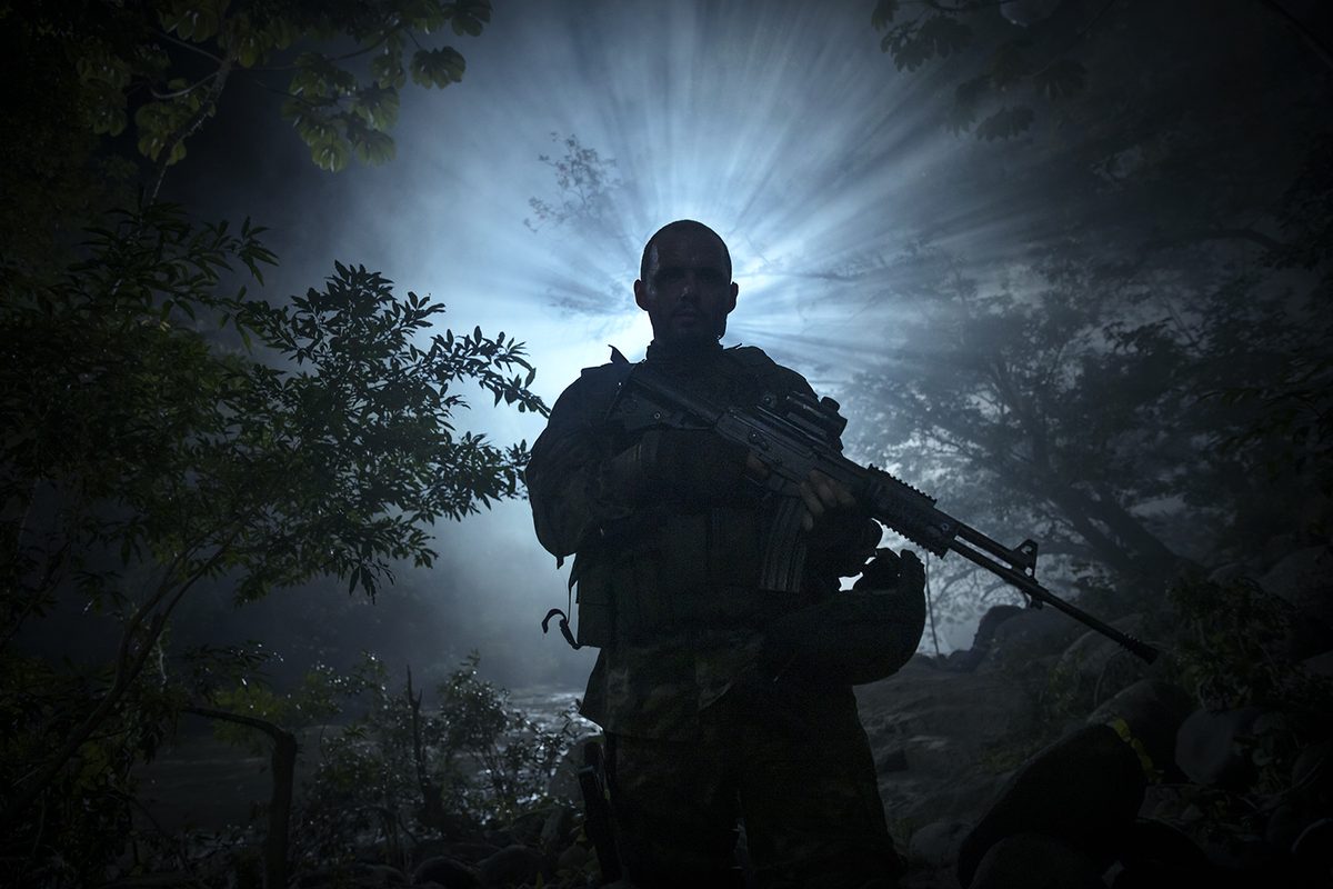
Mil Colmillos: Cinematic Key Art for an HBO Max Series
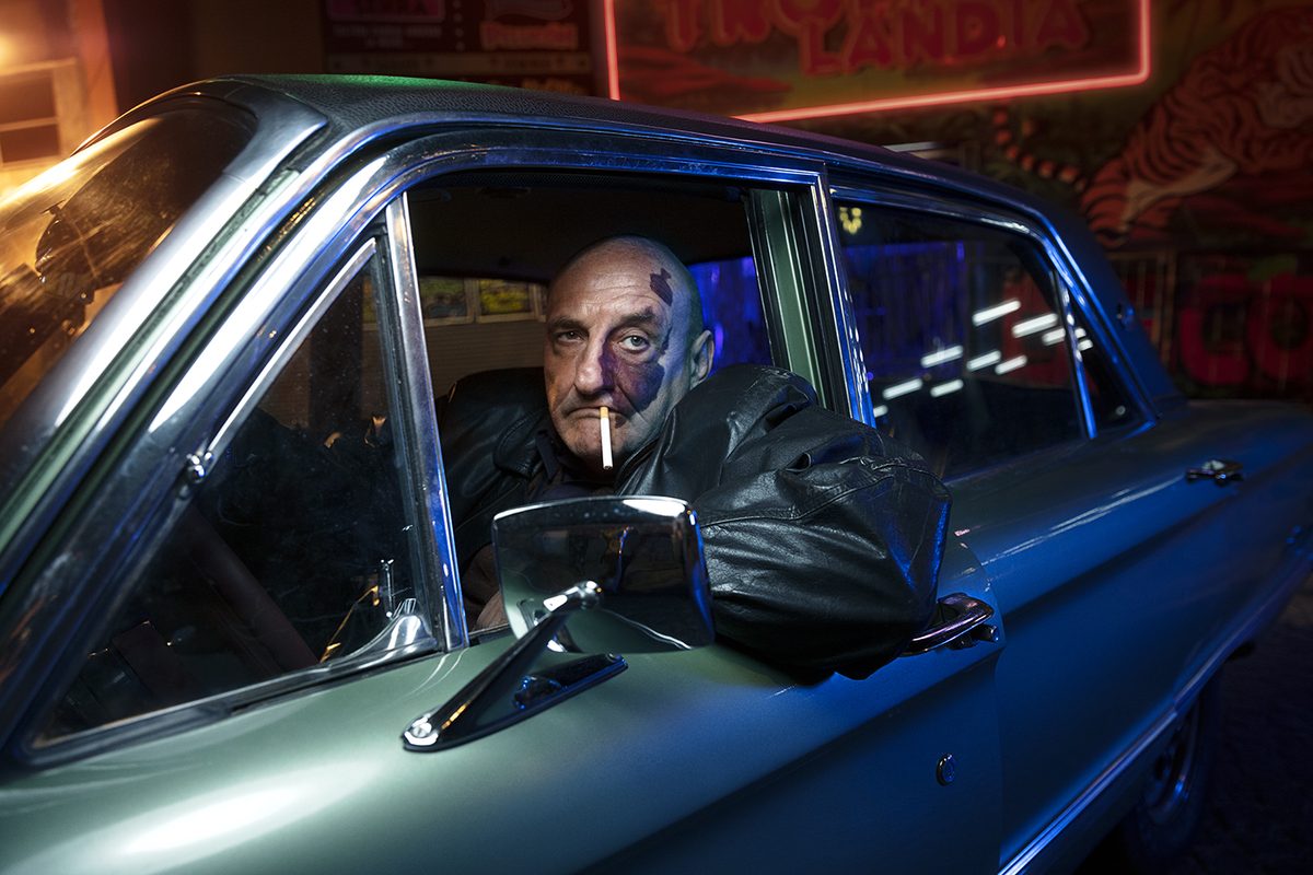
Entre Hombres: Shooting Cinematic Key Art for HBO in Buenos Aires